Getting Started with Svelte by building a landing page
Learn Svelte by building a landing page using HTML, CSS, JavaScript-
 Sriram Thiagarajan
- August 27, 2021
Learn Svelte by building a landing page
Introduction
Svelte helps in building web applications using HTML, CSS and Javascript. Unlike React, Svelte doesn’t have Virtual DOM or any other abstraction on top. It acts as a compiler that spits out vanilla Javascript. This means that Svelte is added as a dev dependency and results in faster execution speed of the application
Getting started with Svelte
You can use the following command provided to get a copy of the template and start working
npx degit sveltejs/template comapny-landing-page
cd comapny-landing-page

# to use TypeScript run:
# OPTIONAL to run the following command
node scripts/setupTypeScript.js
It is optional to run the setupTypeScript.js file which will set up the project to use TypeScript instead of Javascript. If you are not familiar with TypeScript, you can skip this step.
I feel like it is easier to start with Svelte after learning the basics of HTML, CSS, and Javascript.
Install the dependencies and start the project
npm install
npm run dev
Prerequisites
- Basic understanding of HTML, CSS, Javascript
- Familiarity working with Node ecosystem
In this article, we don’t discuss in-depth about the CSS properties used to make the design. If you are not familiar with any of the CSS properties, you can reach out to me
Landing page design
Building a landing page for your personal website can be a good way to start your dev journey. It mostly has static content and the focus will be on building the layout and styles
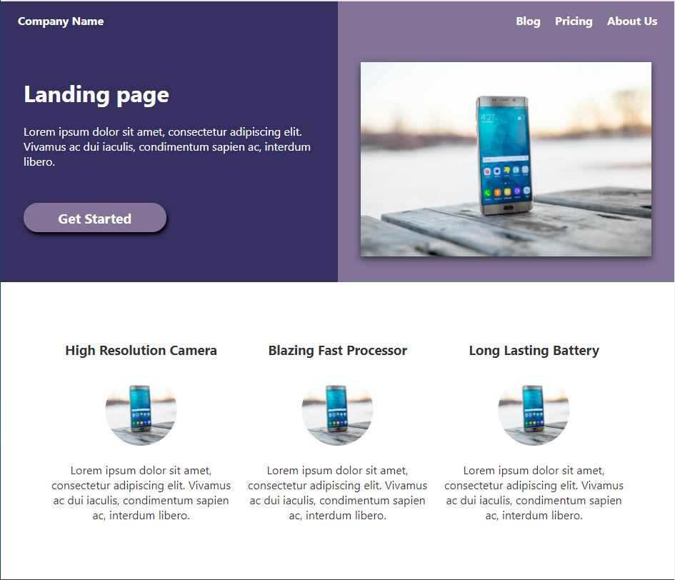
Simple landing screen showcasing a product with a call to action button
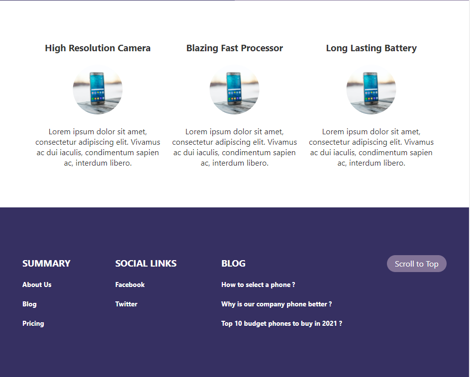
Adding a footer at the bottom of the design
We can divide the design into four component
- Top Menu bar
- Call to Action Content
- Features List
- Footer
First Svelte component
From the template, we will have a couple of files which are of interest.
- main.ts - The starting point of the app
- App.svelte - First Svelte component
import App from './App.svelte';

const app = new App({
	target: document.body,
	props: {
		name: 'world'
	}
});

export default app;
Inside the main.ts file, we are importing the Svelte component and exporting it as a default. It is getting added to the document.body
Breakdown of Svelte component
<script>
	export let name;
</script>

<main>
	<h1>Hello {name}!</h1>
	<p>Visit the <a href="https://svelte.dev/tutorial">Svelte tutorial</a> to learn how to build Svelte apps.</p>
</main>

<style>
	main {
		text-align: center;
		padding: 1em;
		max-width: 240px;
		margin: 0 auto;
	}
	h1 {
		color: #ff3e00;
		text-transform: uppercase;
		font-size: 4em;
		font-weight: 100;
	}
	@media (min-width: 640px) {
		main {
			max-width: none;
		}
	}
</style>
A component is divided into three parts
- HTML markup
- Script
- Styles
You can directly start typing the HTML markup on the file and svelte will render that in the DOM
Scripts are added inside the . You can have Javascript code that controls the component here.
Note: Svelte has native support with Typescript as well and running the script at the start of the template makes all the .js files to .ts files.
Finally, CSS are added into the
This feels very familiar for anyone who has worked with HTML
index.html and global CSS styles are present inside the build folder from the template
Building the top menu
After learning the basics of Svelte, let’s start by building the Top Menu component. It is easy to split your codebase into multiple small components.
We will create a new file and import that file into the App.svelte
Create a new folder called components and create a file called Menu.svelte
Convention is to use a Capitalized name for your component names to differentiate it with HTML Elements
<nav role="navigation">
	<div class="left_div">
		<a href="/">Company Name</a>
	</div>
	<div class="right_div">
		<a href="/">Blog</a>
		<a href="/">Pricing</a>
		<a href="/">About Us</a>
	</div>
</nav>

<style>
	nav {
		display: flex;
		background-color: #363062;
	}
	nav a {
		color: white;
		padding: 0 0.5rem;
		font-weight: bold;
	}

	nav a:hover {
		text-decoration: none;
	}

	nav div {
		flex: 1;
		padding: 1rem;
	}
	.right_div {
		text-align: right;
		background-color: #827397;
	}

</style>
CSS Scopes
If you are already familiar with using CSS in other frameworks, you might look at the above styles and think, adding styles directly to div is not the best way as it would affect your other components. Although I will agree with your point, Svelte helps in keeping these styles only specific to the component.
One of the nice features of Svelte is that the CSS inside the component is scoped to only affect that component. This means that your styles are not leaked outside the component.
This makes it very easy for writing styles inside the component and not to think about how it will affect the rest of the application.
Let’s add the component to the App.svelte
<script lang="ts">
	import Menu from './components/Menu.svelte';
</script>

<Menu />

<style>
	:root {
		font-family: sans-serif;
		padding: 0;
	}
</style>
Code is very simple to import the Svelte component and then add it as part of the HTML markup
Main content with Image
Adding the main content to the page as per the design will follow the same steps as above. Creating a new file and importing it into the App.svelte
<script lang="ts">
	export let CTA_Name: string = "Click Here";
</script>

<main>
	<div>
		<h1>Landing page</h1>
		<p>Lorem ipsum dolor sit amet, consectetur adipiscing elit. Vivamus ac dui iaculis, condimentum sapien ac, interdum libero. </p>

		<button>{CTA_Name}</button>
	</div>
	<div class="right_side">
		<img src="images/mobile_cover.jpg" width="100%"  alt="Mobile diplay"/>
	</div>
</main>

<style>
	main {
		display: flex;
		flex-direction: row;
		color: white;
	}

	div {
		padding: 2rem;
		flex: 1;
		background-color: #363062;
	}

	.right_side {
		background-color: #827397;
	}

	img {
		box-shadow: 0px 4px 10px #333;
	}

	button {
		margin-top: 2rem;
		min-width: 200px;
		border-radius: 2rem;
		background-color: #827397;
		color: white;
		font-weight: bold;
		font-size: 1.2rem;
		border: 0px;
		box-shadow: 2px 4px 5px black;
	}
</style>
Passing props to the component
Most of the components will require data to be passed in from a higher-level component. We can achieve this by using the props in the component. It is very simple to create props. Just add it as a variable in the scripts like the example below
<script lang="ts">
	export let CTA_Name: string = "Click Here";
</script>
Here we are exporting the variable CTA_Name which will act as a prop. We can also assign a default value for the prop if it is not provided.
To send data to the prop, you can update the App.svelte to pass the variable
<script lang="ts">
	import Menu from './components/Menu.svelte';
	import Main from './components/Main.svelte';
</script>

<Menu />
<Main CTA_Name={"Get Started"}/>
Creating the features component
For the Features, we have created a TypeScript type call FeatureType and added the model inside it.
<script lang="ts">
	type FeatureType = {
		id: number;
		heading: string;
		content: string;
		img: string;
	};
	export const articles: FeatureType[] = [
		{
			id: 1,
			content:
				"Lorem ipsum dolor sit amet, consectetur adipiscing elit. Vivamus ac dui iaculis, condimentum sapien ac, interdum libero.",
			heading: "High Resolution Camera",
			img: "images/mobile_cover.jpg",
		},
		{
			id: 2,
			content:
				"Lorem ipsum dolor sit amet, consectetur adipiscing elit. Vivamus ac dui iaculis, condimentum sapien ac, interdum libero.",
			heading: "Blazing Fast Processor",
			img: "images/mobile_cover.jpg",
		},
		{
			id: 3,
			content:
				"Lorem ipsum dolor sit amet, consectetur adipiscing elit. Vivamus ac dui iaculis, condimentum sapien ac, interdum libero.",
			heading: "Long Lasting Battery",
			img: "images/mobile_cover.jpg",
		},
	];
</script>

<div class="features">
	{#each articles as article (article.id)}
		<div class="feature">
			<h3>{article.heading}</h3>
			<img width="60%" src={article.img} alt={"Mobile content logo"} />
			<p>{article.content}</p>
		</div>
	{/each}
</div>

<style>
	.features {
		display: flex;
		justify-content: center;
		gap: 10px;
		padding: 4rem;
		text-align: center;
	}
	img {
		clip-path: circle(50px at center);
	}
	.feature {
		flex: 1;
	}
</style>
Handling callback from the component
Components can provide events to the parent. This can be achieved using createEventDispatcher and passing the custom event needed from the child component.
In this example, we will have a button “Scroll to Top” in the footer which will pass the event to the parent. The parent component can handle the function of how to scroll the page.
We are not passing any extra data in the event, but that can also be done easily by passing an object when calling the dispatch method.
<script lang="ts">
	import { createEventDispatcher } from 'svelte';

	const dispatch = createEventDispatcher();

	const onBackToTop = () => {
		dispatch('scrollToTop', {});
	}
</script>

<footer>
	<div>
		<h3>Summary</h3>
		<h5>About Us</h5>
		<h5>Blog</h5>
		<h5>Pricing</h5>
	</div>

	<div>
		<h3>Social Links</h3>
		<h5>Facebook</h5>
		<h5>Twitter</h5>
	</div>

	<div>
		<h3>Blog</h3>
		<h5>How to select a phone ?</h5>
		<h5>Why is our company phone better ?</h5>
		<h5>Top 10 budget phones to buy in 2021 ?</h5>
	</div>

	<div>
		<button on:click={() => onBackToTop()}>Scroll to Top</button>
	</div>
</footer>

<style>
	footer {
		display: flex;
		justify-content: space-around;
		background-color: #363062;
		color: white;
	}

	footer h3 {
		text-transform: uppercase;
	}

	footer div {
		padding: 5rem 2rem;
	}

	footer button {
		margin-top: 1rem;
		min-width: 120px;
		border-radius: 2rem;
		background-color: #827397;
		color: white;
		border: 0px;
	}
</style>
Once the child component has defined the custom event, the parent component can listen to the event and perform any action needed.
Here on the Footer component, we have on:scrollToTop event which will call the scrollToTop function.
<script lang="ts">
	import Menu from './components/Menu.svelte';
	import Main from './components/Main.svelte';
	import Features from './components/Features.svelte';
	import Footer from './components/Footer.svelte';

	const scrollToTop = () => {
		scrollTo({top: 0});
	}
</script>

<Menu />
<Main CTA_Name={"Get Started"}/>
<Features />
<Footer on:scrollToTop={() => scrollToTop()}/>
<style>
	:root {
		font-family: sans-serif;
		padding: 0;
	}
</style>
Summary
This article covers building a quick landing page using Svelte. If you have any questions or feedback feel free to reach out on our Discord server.
Stay tuned by subscribing to our mailing list and joining our Discord community
