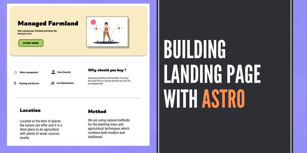
How to make a landing page with Astro, HTML, CSS
Follow along with this code walk through on how to build a landing page with Astro using a unique landing page design.-
 Sriram Thiagarajan
- September 15, 2022
Building landing page with Astro
What is Astro
Astro is a meta-framework for building websites with your favorite frontend frameworks like Svelte, React, Preact and others. The key selling point of Astro is the way it approaches the static site generation in which it ships zero javascript to the browser.
It can do more than just static site generators using the island architecture which means that you can have SEO-friendly content when needed and also have interactive elements to spice up your webpage.
If the above two sentences are full of just jargon that you are not able to follow, don’t worry. Astro is great for most of the websites which is not updated on an hourly basis. It is specifically good if you want to build landing pages/product pages that need to be indexed by search engines.
We will look into the specifics as we start building the application
What are we building
We are going to build a simple landing page for a product that contains a Hero component at the top and a list of features below that.
Prerequisites
- You will need a basic understanding of HTML and CSS
- You will need to have Node js installed in your system
Initialize the Astro project
You can start with an Astro project using the following command. It gives a series of prompts that will guide you into creating your project
npm create astro@latest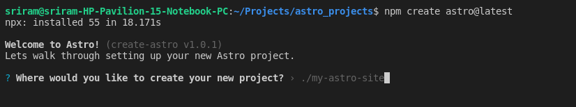
- Where would you like to create your new project? - Provide the path of the folder and the project name - astro-landingpage
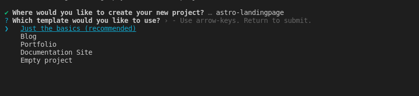
- Which template would you like to use? › Just the basics
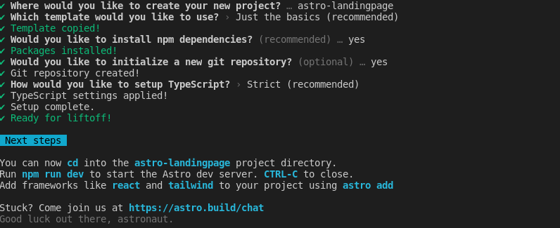
The rest of the questions are straight forward and answer them with the below options
-
Would you like to install npm dependencies? (recommended) … yes
-
Would you like to initialize a new git repository? (optional) … yes
-
How would you like to setup TypeScript? › Strict (recommended)
Now the Astro project is ready to get started. You can see in the package.json file we have just one dev dependencies like below
{
  "name": "@example/basics",
  "version": "0.0.1",
  "private": true,
  "scripts": {
    "dev": "astro dev",
    "start": "astro dev",
    "build": "astro build",
    "preview": "astro preview",
    "astro": "astro"
  },
  "devDependencies": {
    "astro": "^1.1.1"
  }
}
Since it is under devDependencies, astro is not shipped with the build which means that we get only the static HTML needed for our application.
We also have a few scripts in the package.json file which correspond to the following
dev- Running the development server locallystart- Same as the Dev scriptbuild- Building the project. This will generatedistfolder which contains the build for running the websitepreview- Used to preview the build in thedistfolder locally.astro- Can be used to run other Astro commands
Astro Project structure
Astro has an opinionated folder structure for your project which means that there are specific folders that you need to know about to get your job done easily.
Directories and Files
src/*- Main source codepublic/*- Assets (Images, icons, etc)astro.config.mjs- Config file for Astro
Learn more about the project structure in the below official link
https://docs.astro.build/en/core-concepts/project-structure/
Building the layout
Layouts are part of Astro which makes it easy for the developer to reuse some of the structure which is needed for most applications. If you have a Navbar, Header, and Footer component on all your pages, you can use Layout to add that component and use that layout on all the pages.
So when you want to change something in your layout, all the pages which use that layout are automatically changed.
So let’s define our layout for this application. This is going to be simple for this design since we can have the Footer in the layout and the rest of the content will be on the page.
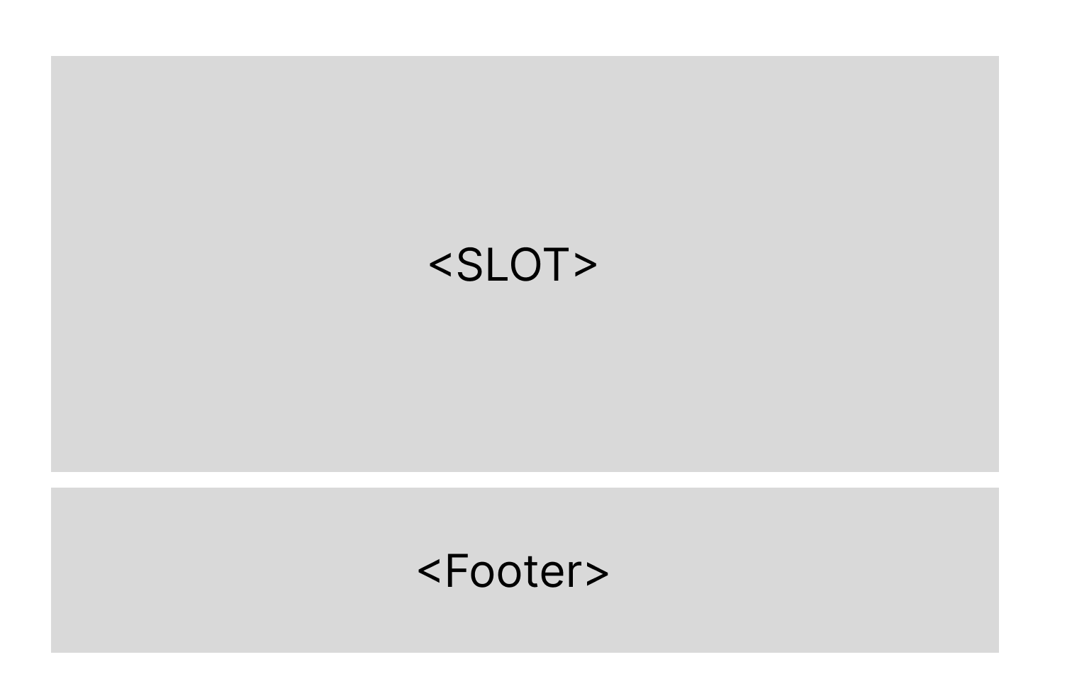
Let’s build that in code. I am going to reuse the already present Layout.astro files in the layouts folder. You can choose to create a new file if you like.
---
export interface Props {
	title: string;
}

const { title } = Astro.props;
---

<!DOCTYPE html>
<html lang="en">
	<head>
		<meta charset="UTF-8" />
		<meta name="viewport" content="width=device-width" />
		<link rel="icon" type="image/svg+xml" href="/favicon.svg" />
		<meta name="generator" content={Astro.generator} />
		<title>{title}</title>
	</head>
	<body>
		<slot />
		<Footer/>
	</body>
</html>
<slot> tag will be replaced by the actual HTML of your page when you are using this layout file.You can learn more about layout in the following link
https://docs.astro.build/en/core-concepts/layouts/
Building the Footer component with Astro
Let’s create a new file called Footer.astro and we can add simple footer details on that component. We will not go into detail about the HTML component used but you can see the overview of the file below.
<div class="footer">
    <div class="footer-col">
        <b>Site Map</b>
        <br/>
        <a href="/home">Home</a>
        <a href="/about">About</a>
        <a href="/pricing">Pricing</a>
    </div>
    <div class="footer-col">
        <b>Address</b>
        <br/>
        485 Essex Court<br/>
        South Burlington<br/>
        Mobile No:	802-505-1847
    </div>
    <div class="footer-col">
        <b>Social</b>
        <br/>
        <a href="/">Facebook</a>
        <a href="/">Twitter</a>
        <a href="/">Instagram</a>
        <a href="/">Reddit</a>
    </div>
</div>

<style>

    .footer{
        display: flex;
        flex-direction: row;
        justify-content: space-evenly;
        gap: 50px;
        padding: 4rem 2rem;
        background-color: #F9EBC4;
    }

    .footer-col {
        display: flex;
        flex-direction: column;
    }
</style>
We have a simple three-div structure and using flexbox, we can align them as three columns using the CSS in the <style> tag
The CSS in the <style> tag is scoped locally which means that it won’t affect the other components. This is a neat feature that requires some external packages and solutions in other frameworks. It works out of the box in Astro
The result will look like below image. Since we are yet to remove the content of index.astro default file, you will get the default page with the footer
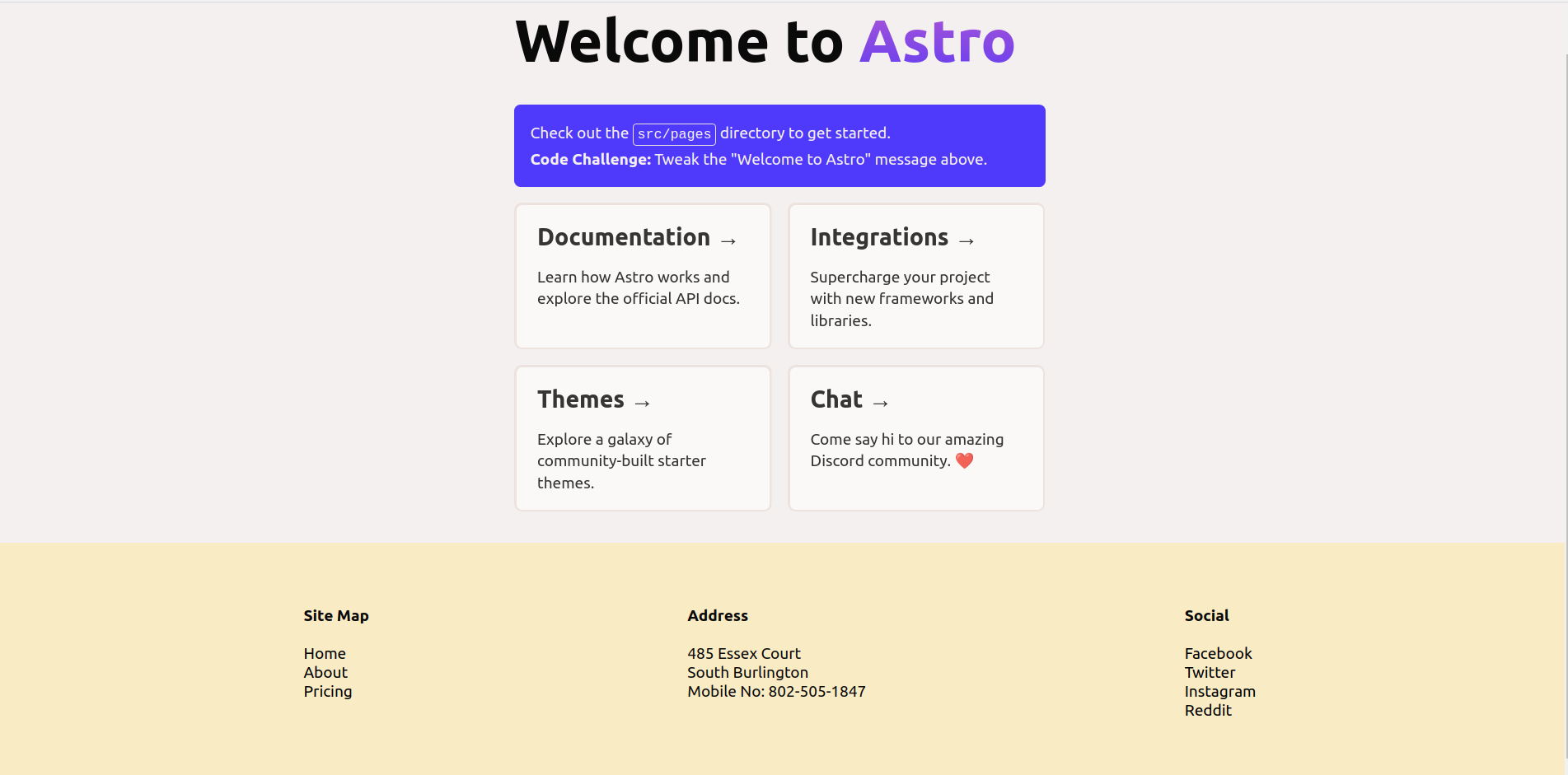
Building the Content page
Let’s start by building the content page now. Clear all the contents of index.astro file
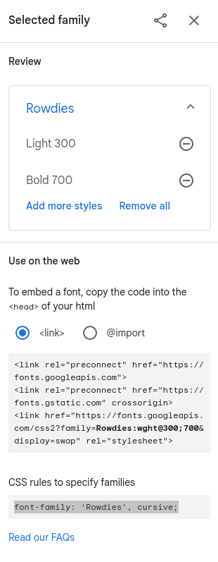
Updating the font family
Based on the design, we are going to use this font family from Google Fonts - Rowdies.
You can add the link to the font in the Layout.astro file
<html lang="en">
	<head>
		...
		<link rel="preconnect" href="https://fonts.googleapis.com">
		<link rel="preconnect" href="https://fonts.gstatic.com" crossorigin>
		<link href="https://fonts.googleapis.com/css2?family=Rowdies:wght@300;700&display=swap" rel="stylesheet">
	</head>


</html>
<style>
	....
	html {
		font-family: 'Rowdies', cursive;
	}

</style>
You can these snippets directly from the Google Fonts website. We are adding the <link> tag to the <head> to download the font from the Google fonts. Then we add the font-family to the html in order to set the font for the whole page.
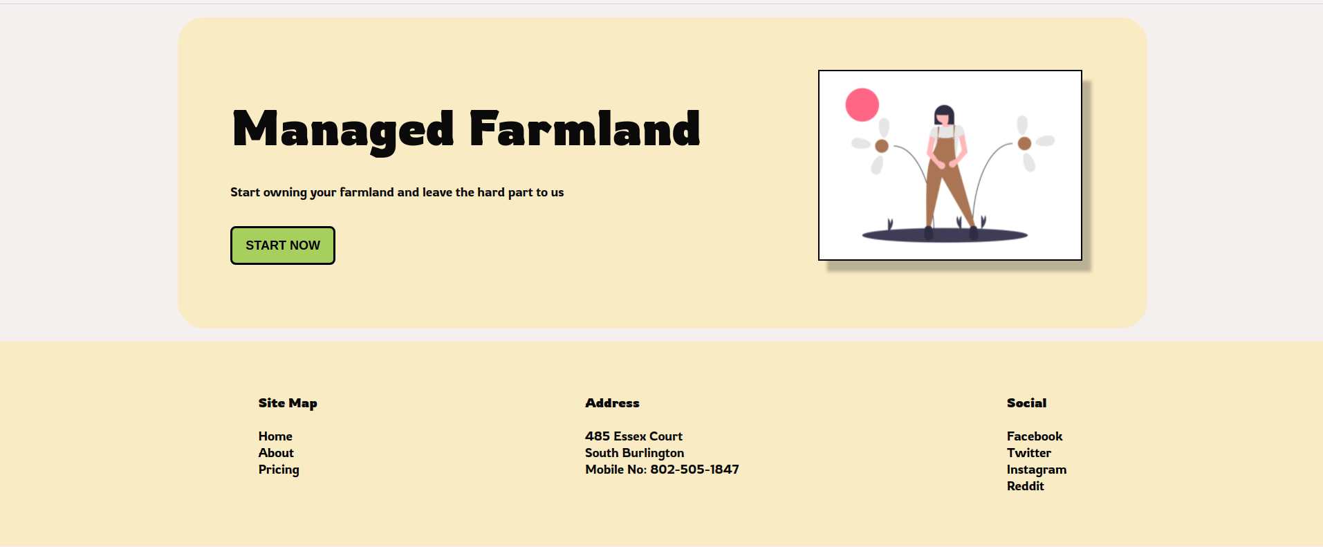
Building the Header in Astro
Let’s create the header of the design in Astro file. Create a new folder inside the component called landingpage and add the home page components to that folder
So create a file name herosection.astro inside src/components/landingpage
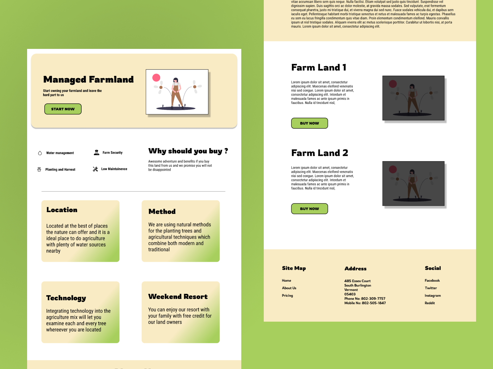
<div class="hero-section">
    <div>
        <h1>Managed Farmland</h1>
        <p>Start owning your farmland and leave the hard part to us</p>
        <button>Start Now</button>
    </div>
    <img src="hero-image.svg" width="400px"/>
</div>

<style>
    .hero-section {
        margin: 1rem;
        padding: 4rem;
        border-radius: 2rem;
        background-color:#F9EBC4;
        display: flex;
        flex-direction: row;
        gap: 2rem;
    }

    .hero-section div {
        flex: 1
    }

    .hero-section div p {
        margin: 2rem 0px;
    }
</style>
There are a couple of things to note in this component
- Adding an image to Astro - You can add the images you want to display into the
publicfolder and you can access the file directly in the<img/>tag. - We want to add a global style to the button and so you can use the
:global()syntax to add CSS styles that will be applied globally
We have added the global style for the header in this Layout.astro file
:global(button) {
		background: #A7CF5D;
		border: 3px solid #000000;
		border-radius: 8px;
		font-size: large;
		padding: 0.75rem 1rem;
		font-weight: bold;
		text-transform: uppercase;
	}
Updating the Landing page
After creating the Hero section component, we need to update the main index.astro file to add the new component
---
import HeroSection from '../components/landingpage/HeroSection.astro';
import Layout from '../layouts/Layout.astro';
---

<Layout title="Managed Farmland">
	<main>
		<HeroSection/>
	</main>
</Layout>

<style>

	:global(h1) {
		margin: 2rem 0;
	}

	main {
		max-width: 1440px;
		margin:auto
	}
</style>
Result of the Hero section
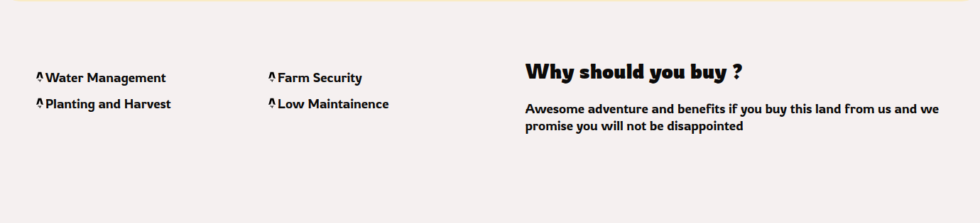
Why Us Section
We have an interesting section after the Hero section about some of the details of the product. We can divide that into two equal halves horizontally using flex
We can then divide the left section into a grid of 4 items and place the items in order with an icon.
Let’s look at the code on how to do that
<div class="section-wrapper">
    <div class="features">
        <span><img src="favicon.svg" width="16" height="16"/>Water Management</span>
        <span><img src="favicon.svg" width="16" height="16"/>Farm Security</span>
        <span><img src="favicon.svg" width="16" height="16"/>Planting and Harvest</span>
        <span><img src="favicon.svg" width="16" height="16"/>Low Maintainence</span>
    </div>
    <div>
        <h2>Why should you buy ?</h2>
        <p>Awesome adventure and benefits if you buy this land from us and we promise you will not be disappointed</p>
    </div>
</div>

<style>
    .section-wrapper {
        display: flex;
        flex-direction: row;
        padding: 2rem;
        gap: 20px
    }
    .section-wrapper div {
        flex: 1
    }

    .features {
        display: grid;
        grid-template: "1fr 1fr";
        padding: 2rem;
    }
</style>
Things to note
- We are saving all the
divinside the.section-wrapperclass to have a flex value set to 1. So there are two divs and both will get the value of 1 which makes the divs equal size - grid-template: “1fr 1fr” stands for dividing the grid into two equal fractions. So the grid is set to have two columns of equal size and depending on the number of items, it decides on the number of rows of the grid.
Features Section
We have another section after the Why Us section with more details.
We can then divide this section into a grid of 4 items and place the items similar to the previous section. We can also add a fancy background gradient for this div to make it look like the design
Let’s look at the code on how to do that
<div class="features-wrapper">
    <div class="box">
        <h2>Location</h2>
        <p>Located at the best of places the nature can offer and it is a ideal place to do agriculture with plenty of water sources nearby</p>
    </div>

    <div class="box">
        <h2>Method</h2>
        <p>We are using natural methods for the planting trees and agricultural techniques which combine both modern and traditional</p>
    </div>

    <div class="box">
        <h2>Technology</h2>
        <p>Integrating technology into the agriculture mix will let you examine each and every tree whereever you are located</p>
    </div>

    <div class="box">
        <h2>Weekend Resort</h2>
        <p>You can enjoy our resort with your family with free credit for our land owners</p>
    </div>
</div>

<style>
    .features-wrapper {
        display: grid;
        grid-template: "1fr 1fr";
        padding: 2rem;
    }

    .box {
        margin: 2rem;
        background: linear-gradient(124.28deg, #F9EBC4 59.55%, #A7CF5D 91.58%);
        border-radius: 20px;
        padding: 1rem;

    }
</style>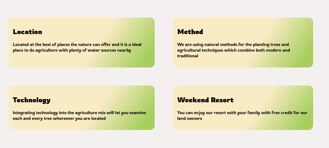
About Us Section
Create a new component inside the landingpage folder of component and name it AboutUsSection.astro
You can add the following content
<div>
    <h2>About Us</h2>
    <p>Lorem ipsum dolor sit amet consectetur adipisicing elit. Impedit repudiandae maxime tempora modi culpa provident necessitatibus distinctio, esse libero aliquid magnam cumque earum, totam soluta amet ex reiciendis voluptate! Veniam.</p>
    <p>Lorem ipsum dolor sit amet consectetur adipisicing elit. Impedit repudiandae maxime tempora modi culpa provident necessitatibus distinctio, esse libero aliquid magnam cumque earum, totam soluta amet ex reiciendis voluptate! Veniam.</p>
    <p>Lorem ipsum dolor sit amet consectetur adipisicing elit. Impedit repudiandae maxime tempora modi culpa provident necessitatibus distinctio, esse libero aliquid magnam cumque earum, totam soluta amet ex reiciendis voluptate! Veniam.</p>
</div>

<style>
    div {
        padding: 2rem;
        margin: 2rem 0px;
        background-color:#F9EBC4;
    }
</style>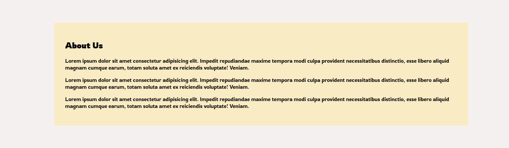
Project Section
Create a new component inside the landingpage folder of component and name it Projects.astro
<div class="projects">
    <div class="project-item">
        <div>
            <h2>Farm Land 1</h2>
            <p>Lorem ipsum dolor sit amet consectetur adipisicing elit. Soluta, eos. Repellat magnam maiores maxime in voluptate neque, ipsum modi sint recusandae ducimus explicabo. Perspiciatis aut dolor quaerat soluta tempore ullam!  Lorem ipsum dolor sit amet consectetur adipisicing elit. Unde corporis eaque soluta commodi doloremque dolores ratione perspiciatis nobis, fugiat quis temporibus officia qui, voluptatibus voluptatem harum? A corporis animi debitis!</p>
            <button>Buy Now</button>
        </div>
        <div>
            <img src="hero-image.svg"/>
        </div>
    </div>

    <div class="project-item">
        <div>
            <h2>Farm Land 2</h2>
            <p>Lorem ipsum dolor sit amet consectetur adipisicing elit. Soluta, eos. Repellat magnam maiores maxime in voluptate neque, ipsum modi sint recusandae ducimus explicabo. Perspiciatis aut dolor quaerat soluta tempore ullam!  Lorem ipsum dolor sit amet consectetur adipisicing elit. Unde corporis eaque soluta commodi doloremque dolores ratione perspiciatis nobis, fugiat quis temporibus officia qui, voluptatibus voluptatem harum? A corporis animi debitis!</p>
            <button>Buy Now</button>
        </div>
        <div>
            <img src="hero-image.svg"/>
        </div>
    </div>
</div>

<style>

    .projects {
        padding: 2rem;
        margin: 0 2rem;
    }

    .project-item {
        display: flex;
        flex-direction: row;
        align-items: center;
    }

    .project-item div {
        flex: 1;
        padding: 2rem;
    }

</style>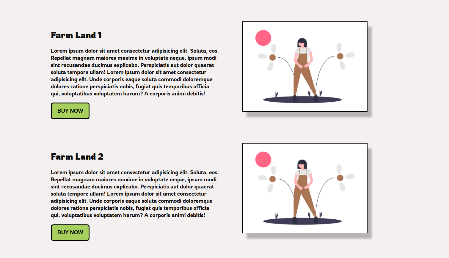
Conclusion
That’s all for today. We have done a full walkthrough of the code needed to get the landing page working in Astro. Join us on Discord if you have other questions
Discord - https://discord.gg/AUjrcK6eep