Using Bootstrap Modal in Svelte
Bootstrap offers an modal which will have the styles needed to show the popup. We can use that in our svelte application to make the styling of the component easier. We will implement it as a separate component which can be reused throughout application.-
 Sriram Thiagarajan
- November 26, 2021
Using Bootstrap Modal in Svelte
Introduction
Modal is a popup which shows for the user to either inform the user or provide some actions for the user to take. Modals should be displayed when the user action is needed before proceeding to the next step. Since modal are displayed over the page and interrupt the user flow, it needs to be used carefully so as to not annoy the user with many popup.
Having said all of this, Modals are a common pattern followed in modern web design to get confirmation from the user before performing an action. When delete button is pressed and the delete action is permanent, it is often a good practice to confirm the action with the user to ensure the action is not a mistake.
Bootstrap Modal
Bootstrap offers an modal which will have the styles needed to show the popup. We can use that in our svelte application to make the styling of the component easier. We will implement it as a separate component which can be reused throughout application.
If you want to learn about setting up bootstrap in your application, follow this tutorial
https://www.eternaldev.com/blog/using-bootstrap-with-svelte/
Example of Modal
Creating a Modal component
After setting up you svelte project, let’s create a new file and call it Modal.svelte
This component will receive a few props from the parent component
- open - Show/Hide the popup
- showBackdrop - Whether to show the black backdrop or not
- onClosed - Function to update the parent component when the popup is closed
We can add more props when needed to further customise the component
<script>
  export let open = false;
  export let showBackdrop = true;
  export let onClosed;

  const modalClose = () => {
    open = false;
    if (onClosed) {
      onClosed();
    }
  }

</script>
We are exporting the three properties which we discussed above and then we have a function modalClose which will be used to close the popup when the close/cancel button is pressed.
{#if open}
<div class="modal" id="sampleModal" tabindex="-1"
role="dialog" aria-labelledby="sampleModalLabel" aria-hidden={false}
>
<div class="modal-dialog" role="document">
<div class="modal-content">
<div class="modal-header">
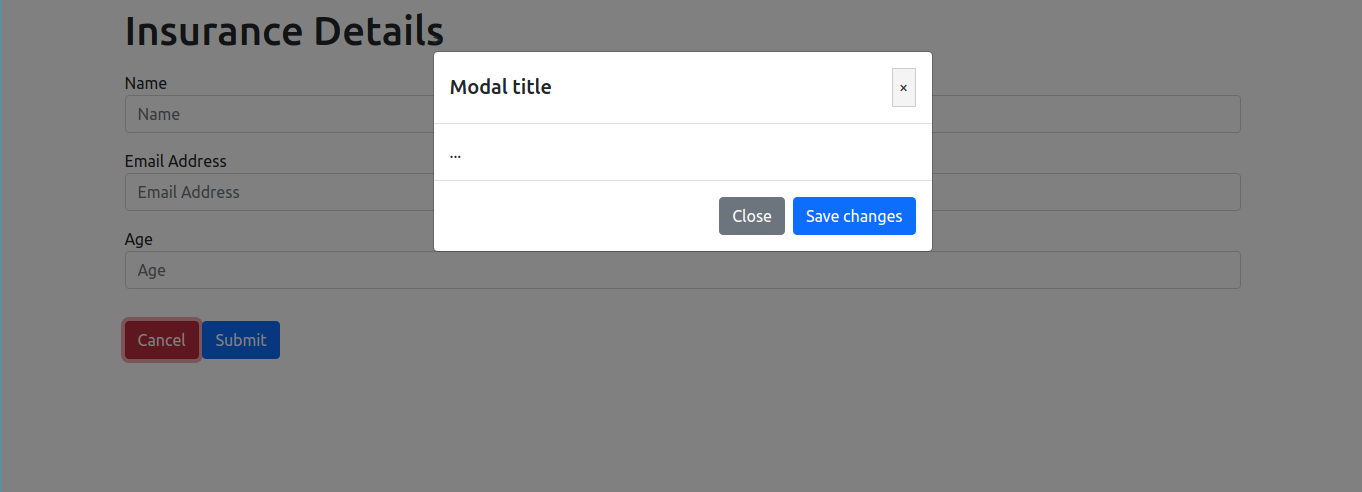
<h5 class="modal-title" id="sampleModalLabel">Modal title</h5>
<button type="button" class="close" data-dismiss="modal" aria-label="Close"
on:click={modalClose}
>
<span aria-hidden="true">×</span>
</button>
</div>
<div class="modal-body">...</div>
<div class="modal-footer">
<button type="button" class="btn btn-secondary" data-dismiss="modal" on:click={modalClose}
>Close</button>
<button type="button" class="btn btn-primary">Save changes</button>
</div>
</div>
</div>
</div>
{#if showBackdrop}
<div class="modal-backdrop show" />
{/if}
{/if}
<style>
.modal {
display: block;
}
</style>Most of the code above is directly from the bootstrap modal example :) The main thing to note here is the if condition. We are showing the popup only when the open prop is true. We are adding an extra style to the modal class to set it to display:block since the bootstrap default hides the popup.
We are adding on:click handlers to both the Close button and X button at the top of the modal to the same function modalClose which will set the open prop to false and call the callback function of the parent.
All of the other classes are added for styling purpose and can be found in bootstrap modal page.
Using the Modal component
Let’s update the App.svelte to use the new Modal component to show the popup.
<script>
	import Modal from "./Modal.svelte";

	let showPopup = false;

	const onCancelClick = (ev) => {
		showPopup = true;
	}

	const onPopupClose = () => {
		showPopup = false;
	}
</script>

<main>
	<div class="container">
		<button type="button" class="btn btn-success" on:click={onShowPopup}>
			Show Popup
		</button>
		<Modal open={showPopup} onClosed={() => onPopupClose()}/>
	</div>
</main>
We are defining one variable which will hold the status of the popup display which is showPopup. On the button click, the variable is update to true which will show the popup. When the close button is clicked in the popup, onPopupClose method is called which updates the variable to false
We now have a simple popup which can be reused in the application.
Return data when the Modal is closed
Since the modal can contain multiple actions for the user to select, you would need a way to know which action was selected. So let’s update the component to return that data.
<script>
	...
	const modalClose = (data) => {
    open = false;
    if (onClosed) {
      onClosed(data);
    }
  }
</script>

...
...
<div class="modal-footer">
    <button type="button" class="btn btn-secondary" data-dismiss="modal"
			on:click={() => modalClose('close')}>Close</button>
    <button type="button" class="btn btn-primary"
			on:click={() => modalClose('save')}>Save changes</button>
</div>
...
...
Update the action buttons in the modal to call the modalClose with some string data. You can make it into some complex object as well. So when calling the parent component, we are passing this data to the parent.
App.svelte
<script>
	...
	const onPopupClose = (data) => {
		showPopup = false;

		console.log(data);
	}
</script>
Adding Animations to Svelte
The modal will benefit a lot by adding some simple animations to show and hide the modal. This can be achieved using the svelte animation properties
<script>
  import { fade, fly } from "svelte/transition";
  import { quintOut } from "svelte/easing";
</script>

{#if open}
  <div class="modal" id="sampleModal" tabindex="-1"
    role="dialog" aria-labelledby="sampleModalLabel" aria-hidden={false}
  >
    <div class="modal-dialog" role="document"
			in:fly={{ y: -50, duration: 300 }}
	    out:fly={{ y: -50, duration: 300, easing: quintOut }}>

      ........
    </div>
  </div>
  {#if showBackdrop}
    <div class="modal-backdrop show" transition:fade={{ duration: 150 }} />
  {/if}
{/if}
Import the fade and fly animation from svelte. We can add it to the modal dialog div and so when it gets shown in the DOM, in: animation is played. When it gets hidden in the DOM, out: animation is played. We can set the animation duration and position to the animation.
Adding title and content props
Modal.svelte
<script>
...
export let open = false;
export let showBackdrop = true;
export let onClosed;
export let title = 'Modal title';
...
</script>
<div class="modal-header">
<h5 class="modal-title" id="sampleModalLabel">{title}</h5>
<button type="button" class="close" data-dismiss="modal" aria-label="Close" on:click={() => modalClose('close')}>
<span aria-hidden="true">×</span>
</button>
</div>
<div class="modal-body">
<slot></slot>
</div>
<div class="modal-footer">
<button type="button" class="btn btn-secondary" data-dismiss="modal" on:click={() => modalClose('close')}>Close</button>
<button type="button" class="btn btn-primary" on:click={() => modalClose('save')}>Save changes</button>
</div>Now we are exposing the title prop to the parent. We can change the title of the modal. We are also adding <slot> in the modal body. Now we can pass the HTML which needs to be shown in the modal from the parent component.
App.svelte
<Modal open={showPopup} onClosed={(data) => onPopupClose(data)}>
	<h2>Testing</h2>
</Modal>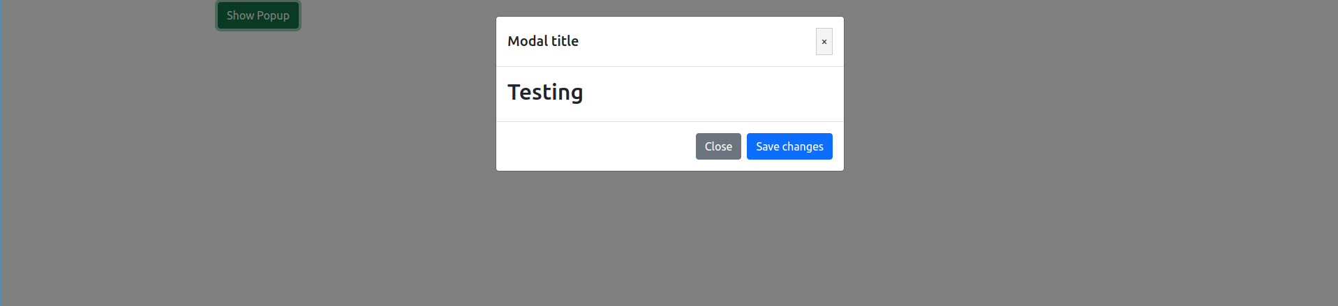
Full code
App.svelte
<script>
import Modal from "./Modal.svelte";

	let showPopup = false;

	const onShowPopup = (ev) => {
		showPopup = true;
	}

	const onPopupClose = (data) => {
		showPopup = false;

		console.log(data);
	}

</script>

<main>
	<div class="container">
		<button type="button" class="btn btn-success" on:click={onShowPopup}>Show Popup</button>

		<Modal open={showPopup} onClosed={(data) => onPopupClose(data)}>
			<h2>Testing</h2>
		</Modal>
	</div>
</main>
Modal.svelte
<script>
import { fade, fly } from "svelte/transition";
import { quintOut } from "svelte/easing";
export let open = false;
export let showBackdrop = true;
export let onClosed;
export let title = 'Modal title';
const modalClose = (data) => {
open = false;
if (onClosed) {
onClosed(data);
}
}
</script>
{#if open}
<div class="modal" id="sampleModal" tabindex="-1" role="dialog" aria-labelledby="sampleModalLabel" aria-hidden={false}>
<div class="modal-dialog" role="document" in:fly={{ y: -50, duration: 300 }} out:fly={{ y: -50, duration: 300, easing: quintOut }}>
<div class="modal-content">
<div class="modal-header">
<h5 class="modal-title" id="sampleModalLabel">{title}</h5>
<button type="button" class="close" data-dismiss="modal" aria-label="Close" on:click={() => modalClose('close')}>
<span aria-hidden="true">×</span>
</button>
</div>
<div class="modal-body">
<slot></slot>
</div>
<div class="modal-footer">
<button type="button" class="btn btn-secondary" data-dismiss="modal" on:click={() => modalClose('close')}>Close</button>
<button type="button" class="btn btn-primary" on:click={() => modalClose('save')}>Save changes</button>
</div>
</div>
</div>
</div>
{#if showBackdrop}
<div class="modal-backdrop show" transition:fade={{ duration: 150 }} />
{/if}
{/if}
<style>
.modal {
display: block;
}
</style>Conclusion
Modal are a nice way to get action from the user which requires immediate attention. Having more than one modal show at the same time is something to be avoided as it might be confusing and annoying for the user.
Let us know your thought about the modal popup component and other feedback in our discord server
Discord - https://discord.gg/AUjrcK6eep